
Blog
Then and Now: Design Trends We Can All Get Behind
Design fads and design trends may sound mysterious and arbitrary but are rooted in realities. Both signal our innate desire for change, for something new, and both reflect some element of what’s going on in our world. Trends usually involve a higher cost factor, and point to a more gradual change, over a longer period of time.
Channeling my inner design anthropologist, 5 design trends I’m seeing fade, what’s coming down the pike to replace them, and why.
THEN
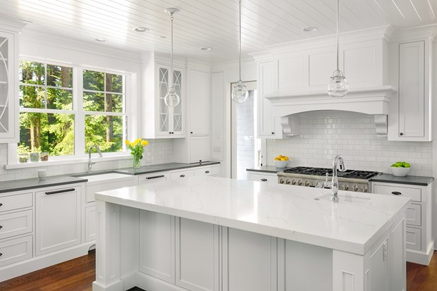
White…on white…on white Nothing more untouchable, more un-maintainable than all-white rooms. Luxury then, now yawn-city and nuisance.
NOW
White…with wood….greenery…and ceramics Use white in a major element or two (walls, floors, tiles, or upholstery), but with organic accents. Using wood (shelves, art, tables, light fixtures), greenery (real or faux) or ceramics feels so right because it resonates with our cells!! This, plus softening, and adding life and dimension to a space

THEN
Manufacturers We’ll always need carefully engineered, mass-produced things made to certain standards. Things like heights of DR tables, measurements of dishwashers, and electrical fittings. Just not everything.
NOW
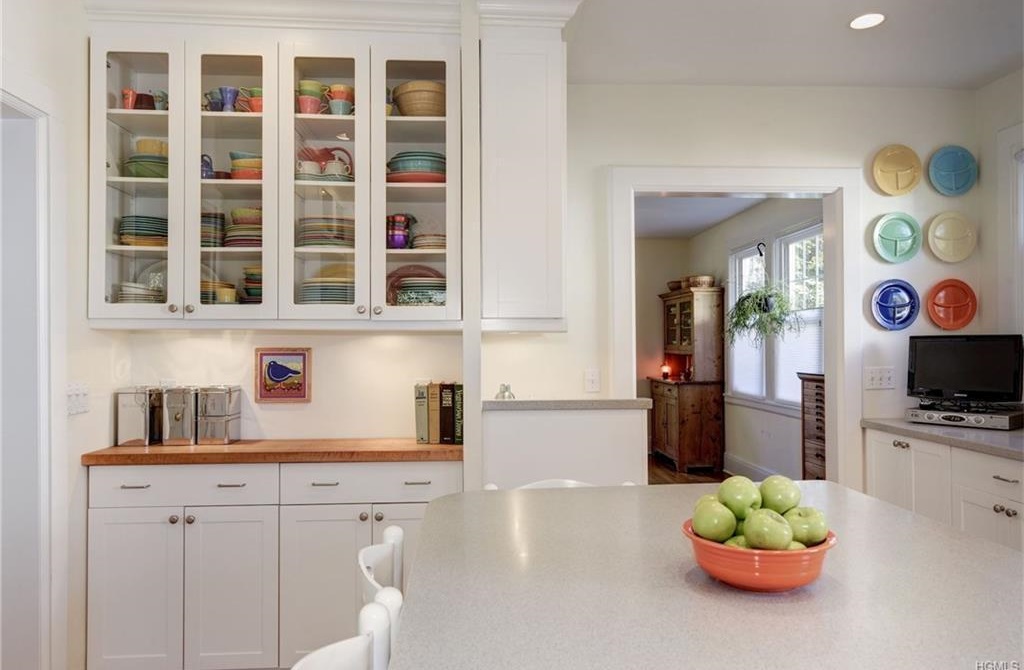
Artists People whose purpose is to figuratively color outside the lines (in any form or material) add indescribable presence to a room. And it needn’t be conventional, cost a fortune, or even be so rarefied.
Etsy is a great source for the reasonable, unexpected and personable. Just go for something that makes you feel ‘ohhhh’ and makes you smile. A hand-thrown pot for your basil, sleek wood and metal coat rack, or a one-of-a-kind tabletop top (at typical height of course) will all add personality to your space.


THEN
Hiring…or DIY I started in this business in the 80s. Design was part sport, part entertainment. If you had money you spent it: acquiring pedigreed things and giving pros lots of latitude to create and implement their visions. Then came the HGTV generation where anyone could do anything.

NOW
Collaborating As long as I’ve been in the business, homeowners have always wanted more from the design process. Besides a pleasing result, for the most part, they also wanted to understand, and participate.
The pendulum had finally reached middle ground: there’ll **ALWAYS** be a need for pros to implement. But because design-type projects don’t happen that often for most of us, many default to one of the 2 “known” models above.
More and more are finding a collaborative model works better. Trust, input, and ongoing communication are required from both parties. Consumers gain knowledge, confidence, and usually more satisfaction.
TRH has always worked collaboratively. Our counsel to clients is that estimates are also interviews. Also a good back and forth of ideas and methodology should count, perhaps as much as the price, depending of course on their own skillset and the nature of the job.
T
 HEN
HEN
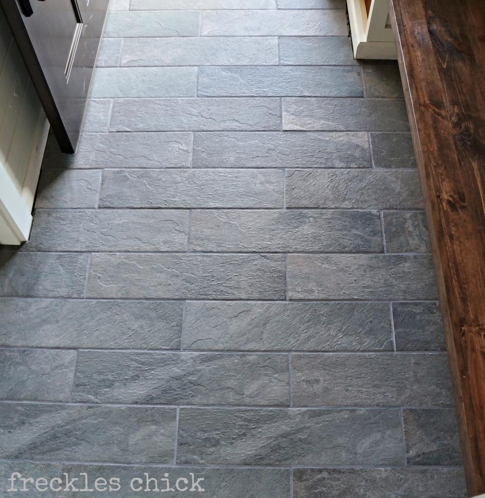
Polished Again, sleek, gleaming, and usually impervious on major surfaces held great allure for many years. Perhaps for the luxury of its near-impossibility to maintain (think pet hair on dark wood, hard water stains on white marble shower surrounds)? This design trend has had its day.
NOW
Textured Wood floors in a medium color and satin finishes, stone countertops in a hammered (aka leather) finish, slate look-alike textured ceramic floor tiles are more forgiving, more interesting if not safer, and usually at the same (or less) cost.
THEN
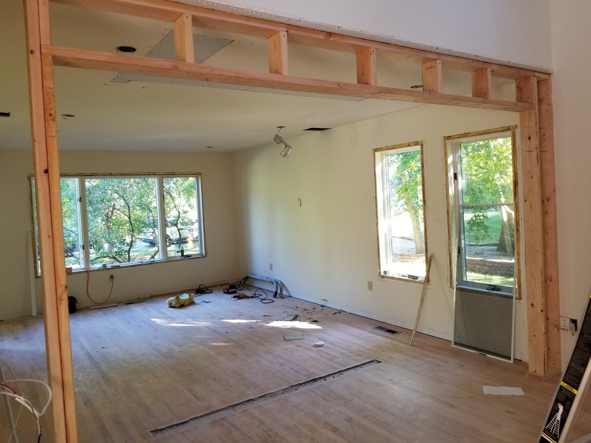
Walls Long before the pandemic hit, the love affair with open floor plans was fading.
COVID certainly made us appreciate defined or private spaces But those who renovated extensively, or purchased an open concept property often had regrets almost immediately after the moving trucks or contractors left. Wall-less, many wondered: where to put the furniture, where to plug in lighting, place electronics, or hang art?
NOW
Boundaries Buying, selling, or staying and improving? Instead of a wholesale nuking of interior walls, look at how space flows, how it ‘feels’ first. Every property, every floor plan is different. But out of date thinking on wall size and placement is a fatal flaw of so many properties.
Adding a knee wall adds privacy in a palatial bathroom; or in the case below, taking part of a full wall down to a half wall opens up a space and adds light.
Below are pics of a waterfront property that had been off and on the market for years, each time in descending price points.


The early 1990s floor plan also had you literally fall into the DR from the entry. And wall-less, you had to paint everything in the same (yawn) color. Constructing a simple 10″ bump out wall added separation and created more presence (which in turn read as more value).


This house, too, had been on the market for some time. 1980s floor plan, previous owner apparently wanted a formal LR. A valid idea, but instead chose to install a floating wall to physically divide the space. This cut light, impeded traffic flow, and just made for unnatural furniture placement in both rooms. Photos below are from front of the house, looking to the back, sofa table is against that floating wall.

Nuking that wall, but building a soffit and a little bump out wall created a slightly narrower, more natural opening. This gave separation, but added value by bringing in light and keeping a spacious feel. Photos below are from back of house, looking towards front of house.


Bottom line: We like our walls, but good use of color, lighting, furniture, and furnishings can also easily define two separate areas within one set of 4 walls. It just depends on you, your space, and your needs and expectations.
The Refreshed Home is a design and listing prep consultancy, specializing in occupied homes in Westchester County NY. Voted Westchester’s Best Home Stager 2019 and 2020, Marie Graham has personally helped get over $600M worth of WC properties noticed, and SOLD.